

Taking Word to Worldwide Web
John Wesley, founder of the Methodism and its many affiliated denominations, claimed, “The world is my parish.” With billions of Internet users, today we can say, “The Worldwide Web is my parish.” Here are my notes from my seminar on taking the Word to the Worldwide Web.
• Introduction
• Writing online
• Planning your site
• Designing your site
• Producing your site
• Promoting your site
Introduction
Several issues make the Internet one of the best ways to spread the gospel:
It’s immediate
The speed in which new information can be uploaded to the Internet, makes this media nearly “real time.” When national and international news breaks, Christian writers can post opinions and helpful articles in a matter of minutes.
• Death of well-known person
• Sporting events
• Terrorist attack
• End of world
It’s available
There are literally billions of Internet users around the world. The numbers are growing too fast to keep this page current. Here are the latest numbers.
It’s effective
Here are two of my favorite emails in response to online ministry:
I wrote you I guess because I questioned the way I interpreted love. I feel I’ve been a loving person all my life until recently. Today, when I look up “love” on the Internet and found your website, it did something to me. In all honesty, when I saw it I said, “Oh, this is just some Bible thing; people trying to get you to believe in God.” I didn’t want to look at it, not because I wasn’t interested, but because I am bitter. I started reading it with this attitude of sarcasm. The funny thing was, though, that for some reason I kept reading it through to the end. Even if I had thoughts of clicking out of that screen, my hand was frozen to the mouse, like God sitting me at a table saying, “Here’s your lesson, now learn it!” I was very strange. Do you think God is trying to tell me something? Margo
Your article [on suicide] saved my life tonight and showing me a path to toward hope. I [am] still in severe pain from the death of my boyfriend six months ago. But, I felt a need to say thank you [name withheld]
It’s interactive
The original Internet was one-way communication, but now with “Comment” boxes, Facebook, Twitter, Instagram, Tumblr, Reddit, etc. etc., the communication has become two-way (Web 2.0). Interaction is as important as information!
Your “social networking” builds your “platform”
This is your ability to reach readers and is absolutely essential for writers land contracts!
Here are some fascinating info and users and trends from WizCase.
Writing online
Just as the technology is very different from print, the writing must be as well. You can’t simply take your article, book excerpt, essay, etc. and click SAVE AS WEBSITE. Here are some of those differences: How to hook today’s Internet users.
And taking the Word to the Worldwide Web also requires a very different approach: Crossing Over with the Cross
Planning your site
Determine your “brand.”
Determine your site’s purpose. Possibilities include:
• Blog
• Evangelistic site
• Library
• Resume
• Soap box
• Store front
• All of the above
Whatever your site’s purpose, it needs the following elements:
• Memorable domain name
Not www2.fwi.com/~watkins! Not
• Your home page
This acts as the hub or “table of contents” for all your online presence—posts, videos, social networking—everything! (The user should be able to find anything on your site within one or two clicks.
• Individual pages
• A link back to the home page on every page!
• Email link
You can obfuscate your address so “spiders” can’t collect it for “spam.”
• Search box
• Google analytics
Designing your site
K.I.S.S.
Keep It Simple Scribes!
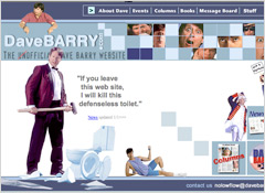
Here is a truly terrible example! Can you find the un-KISS-able design flaws?
1. Microscopic text!
2. ‘Busy’ backgrounds. Ugly backgrounds. Distracting backgrounds.
3. Animated .gifs!
4. Animated .gifs that never stop!
5. Link border around clickable graphics
6. Images with no ALT or TITLE descriptions
7. All text centered
8. Numerous font faces (Is this a website or a ransom note?!)
9. Gaudy bullets
10. Underlined text that is not a link
11. Scrolling marguee text
12. Typos (Animated has one N)
13. Broken links
14. Links that remain the same color after being visited
15. Music, sound effects
16. All body copy in italics or bold
17. Body text that extends from edge to edge of screen
18. Body copy against a busy background
19. Pop ups!
20. Pages that don’t allow me to easily go BACK
21. No phone number or land address on business sites.
22. No email contact information
23. Visible counter
24. Large graphic files that take forever to download
25. “Flash” intros, graphics that do nothing but waste bandwidth
Use good design principles
• Relevance to audience and your brand
Dave Barry | David Jeremiah
National Magazine | National Enquirer
Billy Graham | Billy Bob Brimstone
Consistency in design, elements
• Positioning for eye’s natural tracking
• Proportion
• Contrast between text, graphics and background
• Attention to delight
• RESTRAINT!!! (Keep It Simple, Scribes! And avoid all caps and multiple exclamation points!)
Be consistent across all media. (Notice that my website, Facebook and Twitter pages all have the same logo, pic and background.)
Producing your site
I’ve become very evangelistic about WordPress.com as a user-friendly, easy to use Website creation tool. It provides free hosting and is as simple as filling in dialog boxes, plus there are hundreds of online tutorials.
If you’re still unsure about setting up your site, simply ask your teenager or niece/nephew to help you get it set up. Then it’s easy to keep it updated once the design template has been set up.
Two great sources for free-t0-use photos are UpSplash and MorgueFile. Never fear, “morgue” is simply publishing jargon for photo archives! (Use the direct link above. Googling “morgue files” is going to bring up some really creepy pics!)
A great free, online photo-editing program is BeFunky. I love it!
Testing your site
Use your Facebook friends as a focus group. Ask for feedback on the look, how to reflects your brand, and how easy is it to navigate. Fix all the bugs before . . .
Promoting your site
1. Get your own domain (I’d suggest both your name and your “tag line”)
2. Use keywords on your site
3. Use WordPress’ “Share” feature on your site (It allows visitors to click your social icons to share)
4. Share links with friends
5. Include your URL on your email signature
6. Incorporate your URL into your author blurb at the end of each article
7. Print URL on all your stationery and business cards
8. Offer free stuff: book excerpts, podcasts, videos and music at your site.
9. Offer helpful, relevant resources from your site on Facebook, Twitter, etc.
10. Send out a weekly emailing (Email 40 times more effective than Facebook and Twitter)
In-sites on jameswatkins.com
Here are some random thoughts and theories on why my site seems to be generating more than average amount of traffic (over one million visits in 2005):
1. More content than you can shake a memory stick at
2. Content is constantly changing
3. Content is constantly hyped daily Facebook and Twitter with weekly emailingg.
4. Content addresses felt needs
5. Free stuff (book excerpts, audio talks, videos, etc.)
6. Fast loading
7. Lots of links
Last update: August 2019 (It will be obsolete in a week!)
Copyright © 2008, 2016, 2019 James N. Watkins
If this post was helpful, please share it on your social media. Thanks!